Shane Rounce on Talk Fuse
Super Simple Responsive Grid
Achieving a nice 12-Column responsive grid system really is super simple. Here's what i've used as the starting point for all my grids over the past year.
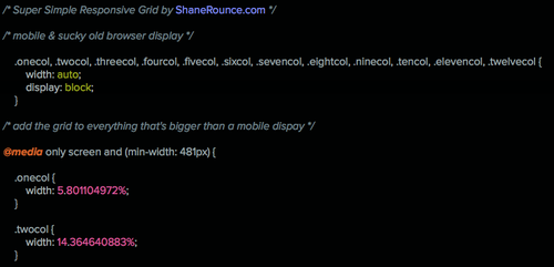
This css applies a fluid, percentage-based, grid to all displays bigger than a mobile.
Grab the contents of (or save) this file for use in your project.
If you're looking to quickly use this in a tumblr theme, drop the following code into your <head>.
<link rel="stylesheet" href="http://static.tumblr.com/o3mi8ie/RbUn69ngx/supr-smpl.css">
To use the grid, apply the basic classes needed for your layout:
.sixcol = 50%, .threecol = 25%, .ninecol = 75% etc.
Then define the position:
.first will stick a grid item to the left, .last to the right. (Only apply to the first/last items on each row.)
.centercol will...., well, you get the idea at this point.
Edit (27/5/2014): Updated this and added the '.clearfix' class. The tumblr include url is updated and this simple little snippet of useful code is now on github, here .
Edit 2 (28/5/2014): Added forgotten required 'box-sizing'.
There's now also a working codepen example.