Aunt Bessie’s updates logo with younger-looking, more welcoming character
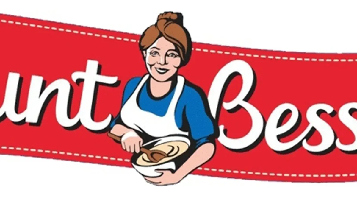
Aunt Bessie’s has updated its logo, replacing the familiar rosy-cheeked woman holding a bowl of batter with a younger-looking character shown with open arms. The brand says the change is intended to feel more contemporary and welcoming, while keeping the character recognisable to long-time customers.
Aunt Bessie’s began producing frozen Yorkshire puddings for Butlins in the 1970s and started selling them under its own label to supermarkets in 1995, later expanding into other potato products. Nomad Foods bought the brand in 2018 for £210 million. The rebrand comes as a survey of 2,000 people found 18 to 29-year-olds were more likely than other generations to add ingredients such as hot sauce, kimchi or avocado to a Sunday roast; 68 per cent said roast potatoes should remain on the plate.
- Aunt Bessie’s has replaced its traditional logo character.
- The brand says the new figure is more contemporary and welcoming.
- A survey found roast potatoes remain a favourite for 68 per cent.
Read the full article at the source →
Originally published by Daily Mail as “Aunt Bessie gets ‘glow-up’ in rebrand as it replaces lady on logo with ‘more contemporary’ younger woman”.