Use this space to roast the new Instagram logo
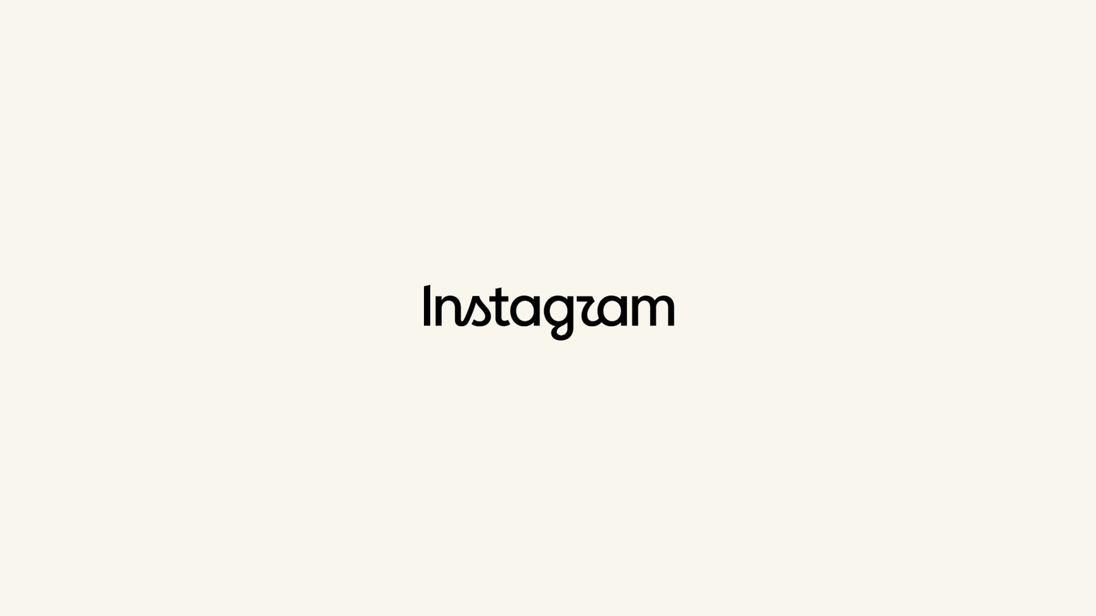
Instagram head Adam Mosseri has unveiled a new wordmark for the platform, describing it as a cleaner, more modern brand refresh. The article treats the change sceptically and humorously, arguing that its blend of cursive and printed lettering is confusing and visually awkward.
The criticism focuses on inconsistent joins and sharply ending strokes, particularly around the “t”, “a”, “g” and “r”. Published on 13 August 2026, the piece suggests the lettering can be misread as “Instagzam” and invites readers to debate—or mock—the redesign.
- Instagram has revealed a new, more modern wordmark.
- Engadget criticises its mixed cursive and print styling.
- The design may be difficult to read at a glance.
Both sides, in good faith
The strongest fair case each way — we don't pick a winner.
The case for
Critics can reasonably argue that a wordmark for a globally recognised platform should be instantly legible and visually coherent at a glance. If the mixture of cursive and printed forms creates awkward joins or makes letters easy to misread, the redesign may weaken clarity without offering a sufficiently distinctive benefit; the humour reflects a legitimate expectation that a major brand’s core identity be carefully resolved.
The case against
Supporters can reasonably view the refresh as an attempt to make Instagram’s identity feel more contemporary and human rather than mechanically uniform. A slightly unconventional letterform can add character, improve differentiation in a crowded digital market and grow familiar through repeated use, while initial resistance to logo changes is common and does not necessarily indicate a flawed design.