Business news and discussion on TalkFuse.
‘Inclusive’ California wine company calls out Gen Z’s reading skills — says they ‘don’t read cursive’
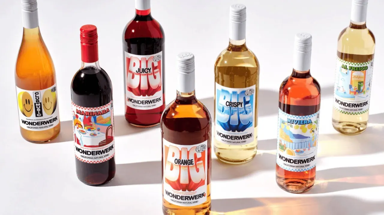
California wine brand Wonderwerk says it avoids cursive on its labels because many of its young customers find it hard to read. The choice reflects its effort to make wine feel accessible to younger drinkers, while challenging the idea that younger generations are uninterested in wine.
Founded in 2017, the company doubled production to 26,000 cases last year and made 30,000 cases this year, as the wider wine industry faces falling sales. Its one-litre bottles cost $25 and are sold at retailers including Whole Foods and Erewhon. The wines use approachable blend names such as “Marinara” and “Al Fresco”; co-founder Issamu Kamide says technical details can make wine feel intimidating.
In short
- Wonderwerk says it avoids cursive because many young customers do not read it.
- The California brand produced 30,000 cases this year.
- Its labels use simple names and bold fonts to make wine approachable.
Steelman: both sides, in good faith
The strongest fair case each way — we don't pick a winner.
The case for
Avoiding cursive and using approachable names can make wine easier for younger or less experienced customers to understand, helping them feel welcome rather than excluded by traditions and technical language. If the company’s aim is to invite more people into wine, clear labels are a practical response to how customers read and shop.
The case against
Wine labels also carry history and character, and cursive can be part of a distinctive design rather than a barrier that needs removing. Some may see the claim about young people’s reading skills as a broad generalisation, and worry that simplifying wine’s presentation risks flattening its culture instead of helping newcomers learn about it.