I’m trying to untangle my response to how the Ocarina of Time remake looks
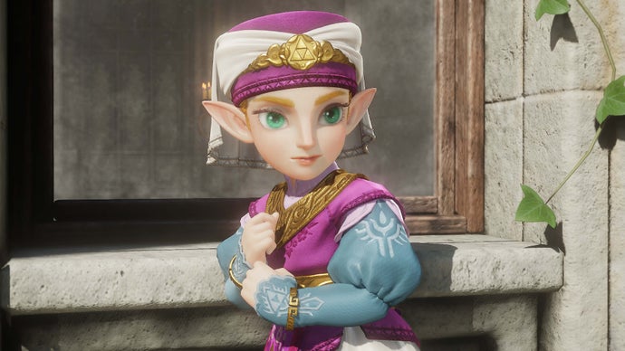
An Eurogamer writer reflects on their shifting emotional reaction to the newly revealed art style for the remake of The Legend of Zelda: Ocarina of Time, initially recoiling at how "weird" and "wrong" the more detailed, modern visuals looked compared with the N64 original. On reflection, they suggest this unease stems from the original's aesthetic being inseparable from the technical limits it was built on, whereas the remake applies Switch 2-era graphical power to a world designed around blocky polygons, resulting in an overload of detail such as waving grass and rain-soaked faces.
The piece is a personal essay rather than a factual report, drawing on the writer's own changing impressions after rewatching the trailer and discussing it with their wife, a fan of the original game. They note that opinions on the art seem to soften with repeated viewing and vary between individuals, and muse more broadly on how memory of playing older games can distort perceptions of how they actually looked, concluding that their response to the remake's visuals remains unresolved but increasingly positive.
- Writer reassesses initial shock at Ocarina of Time remake's detailed new art style
- Modern graphics contrast with N64 original's technically-driven, low-poly aesthetic
- Reflects on how memory and repeated viewing reshape reactions to game visuals