Technology news and discussion on TalkFuse.
Kindle readers can adjust settings to make digital pages feel more like print
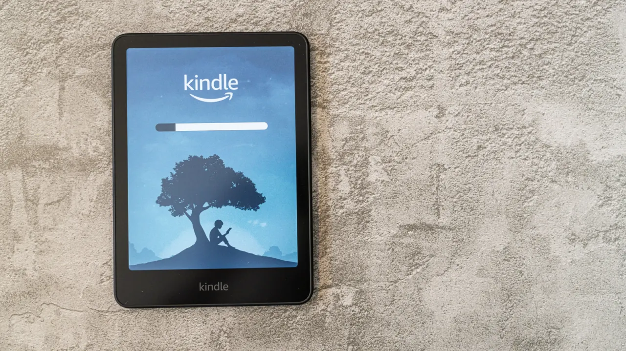
The article outlines settings and accessories intended to make reading on an Amazon Kindle feel more like reading a printed book. Its suggestions focus on changing the device’s appearance and display, which may help readers who find digital pages less comfortable or familiar.
Readers can choose a book-style case, switch to a serif font such as Baskerville or Palatino, or use landscape orientation with two columns. The article also suggests widening margins and increasing text weight, then lowering screen brightness and raising warmth through Quick Actions. The excerpt ends before the full list of advice is shown.
In short
- A book-style case can make a Kindle feel more familiar.
- Serif fonts, two columns and wider margins can mimic print.
- Lower brightness and warmer display settings may feel more like paper.
Read the full article at the source →
Originally published by Engadget as “Improve your Amazon Kindle experience by doing these simple things”.