The new Instagram logo is the perfect embodiment of AI slop
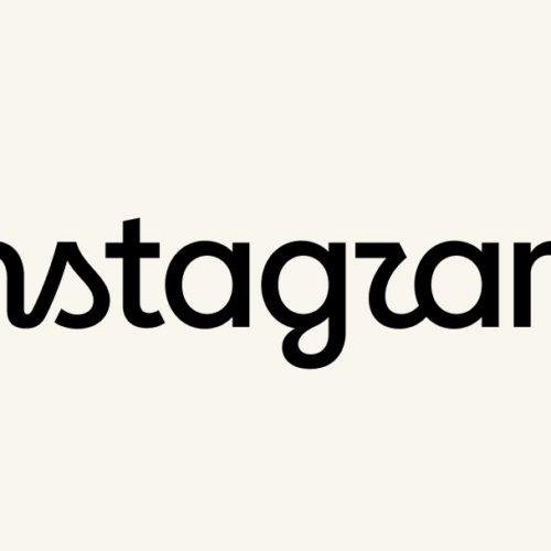
Instagram has introduced a redesigned wordmark, which its head Adam Mosseri described as leaner, more modern and connected to the platform’s original identity. Ars Technica’s creative director argues that the design instead resembles the malformed lettering often generated by AI image tools, making it an unintentionally apt symbol of the “AI slop” era. The criticism centres on whether the refresh is legible and distinctive enough to function as a brand name.
The update is Instagram’s first wordmark change in around 10 years, a long period by current technology-branding standards. The article highlights the unusual shape of the “s”, spacing around the “g”, and especially a letter intended as “r” that the author says reads as “z”, making the name appear as “Instagzam”. The author does not claim Instagram used AI to create the logo, but says its visual flaws resemble AI-generated pseudo-text.
- Instagram’s new wordmark is criticised for resembling AI-generated gibberish.
- The main concern is poor legibility, especially around several letters.
- It is Instagram’s first wordmark update in roughly a decade.